
Most people do not choose the wrong app because the app is bad; they choose the wrong category for the problem they are trying to solve. If your goal is to improve family awareness, reduce daily friction, or meet new people safely, the right choice depends on what kind of support you actually need. An app category is the type of problem a product is built to handle, and in my experience researching parenting technology and online wellbeing, that category decision matters more than brand familiarity, design polish, or download volume.
For users comparing modern apps, three categories often get lumped together simply because they all live on a mobile phone: family online tracking tools, digital assistant products, and social discovery platforms. But they solve different tensions. One is about visibility, one is about task support, and one is about connection. When users mix those purposes, disappointment usually follows.
That distinction is especially useful for parents, couples, young adults managing busy schedules, and anyone trying to be more intentional about phone use. It is less useful for someone looking for a single all-purpose tool, because these categories work best when their job is narrow and clear.
Why do users often misjudge what kind of app they need?
The most common mistake is feature-first thinking. People search for a chatbot, an online status tracker, or a dating-style platform because a feature sounds familiar, then later realize their actual problem was something else. I have seen this repeatedly in digital literacy research: users describe a symptom, but download according to trend.
A parent may say, “I need to know whether my teenager is reachable,” when what they really need is a structured way to understand online availability patterns. A student may search for an assistant app because they feel disorganized, when the deeper need is guided help with specific tasks like writing, meal planning, language practice, or study structure. Another user may install a social app expecting meaningful conversation, but choose a product designed mainly for fast-match behavior rather than sustained interaction.
In other words, the friction usually starts before the install.
How does a family awareness app differ from a digital assistant app?
These categories can look similar in an app store listing because both promise convenience. The difference is in what they monitor or respond to.
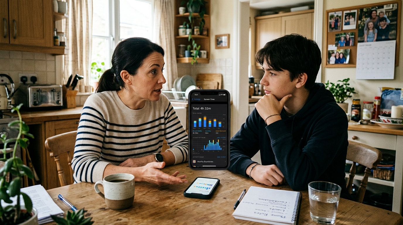
A family awareness app is built around visibility into online behavior, availability signals, or communication timing. Its value is not entertainment. Its value is context. For a household trying to reduce uncertainty around messaging habits, online presence, or response patterns, a specialized tool can be more useful than general-purpose communication software.
A digital assistant app, by contrast, helps a user complete or structure tasks. It may support planning, writing, learning, coaching, idea generation, or routine decisions. It is less about observing another person’s behavior and more about helping the user act with less friction.
That is why comparing them side by side is more helpful than treating them as interchangeable:
| Category | Best for | Main pain point it solves | Common mistake | Watch-out |
|---|---|---|---|---|
| Family online tracking | Households that need clearer visibility into communication patterns | Uncertainty about online status, timing, and responsiveness | Using it as a substitute for direct communication | Needs clear boundaries and realistic expectations |
| Digital assistant | Users who want help with tasks, routines, and everyday decisions | Mental overload and scattered workflows | Expecting one tool to solve every productivity issue | Works best when the use case is specific |
| Social discovery | People looking to meet others, chat, or explore relationship-oriented interactions | Difficulty initiating connections | Choosing based on novelty instead of interaction quality | Safety, intent alignment, and moderation matter |
When does family tracking help, and when does it create more tension?
Family-focused tracking tools can be useful when the problem is ambiguity. If a household regularly struggles with missed messages, unclear availability, or concern about whether someone was online and simply unavailable to respond, pattern-based awareness can reduce unnecessary guessing.
That said, a tracking app is not automatically a healthy choice for every family. It helps most when expectations are already discussed. It becomes counterproductive when one person is trying to use technology to settle emotional uncertainty that should be addressed directly.
For example, a tool like Seen: WA Family Online Tracker fits situations where users want structured insight into last-seen and online activity patterns in messaging environments. That kind of visibility can be practical for family coordination. It is less appropriate if the real issue is trust, conflict, or the need for better household communication habits.
I usually recommend asking three questions before installing anything in this category:
- Is the goal coordination, reassurance, or control?
- Will the information lead to better decisions, or just more checking?
- Have the people involved agreed on the purpose?
If those answers are unclear, the category may not be the right fit yet.
What should users expect from a chatbot or assistant app in daily life?
Assistant products are often judged unfairly because users expect them to think like a person and solve broad life problems. A better expectation is narrower: a good assistant app reduces the effort needed to start, organize, or complete common tasks.
That can include planning dinner, drafting text, practicing a language, building a study routine, generating workout structure, or organizing ideas for work. The strongest products in this category usually do not try to be everything at once. They break support into recognizable use cases.
That is why category design matters. A categorized chatbot and assistant experience can be more practical than a blank conversational interface, because users often do better when they can start with a defined role. A cooking helper should feel different from a writing helper, and a fitness coach should not respond like a study guide.
As a practical example, Kai AI - Chatbot & Assistant reflects this category logic by grouping assistance into task-specific helpers rather than treating every request as the same kind of conversation. That approach is especially useful for users who want faster direction and less setup friction on a mobile device.
Still, assistant apps are not ideal for every need. If your problem is emotional accountability, family trust, or social loneliness, a digital helper may support your routine, but it will not replace a relationship solution.
How is a social discovery app different from a general social app?
Social discovery apps are designed around introductions. Their job is to create opportunities for meeting, matching, chatting, or exploring interest-based connection. That seems obvious, but many users download them with the wrong benchmark in mind. They compare them to messaging apps, community forums, or even lifestyle platforms, then wonder why the experience feels shallow or fast-moving.
The right comparison is not “social app versus social app.” It is intent-driven discovery versus ongoing communication.
A product in this category works best when users know what kind of interaction they want. Casual chat, dating-oriented matching, niche connection, and relationship exploration all create different expectations. The wider the intent range, the more important profile clarity and moderation become.
For instance, Blur: AI Based Social Date App belongs in the social discovery space because it is built around matching and connection scenarios rather than productivity or family oversight. Users evaluating this category should focus less on novelty and more on whether the app helps filter mismatched intent early.

Which pain points matter most when comparing these app categories?
If I strip away store screenshots and marketing language, the real pain points usually fall into five buckets.
1. Unclear purpose.
Users download an app because it is popular, not because it fits the job. This is the single biggest source of churn.
2. Overpromising.
Some tools imply they can improve relationships, productivity, and wellbeing all at once. Most cannot. A category with a narrower promise often performs better in real life.
3. Friction on first use.
If a mobile app requires too much setup before it produces value, many users leave. This matters whether someone is using an older iphone 11, a newer iphone 14, an iphone 14 pro, or an iphone 14 plus. Device generation changes some performance details, but clarity of onboarding still matters more.
4. Mismatch between emotional need and technical tool.
A tracking feature cannot repair trust. A chatbot cannot replace judgment. A discovery app cannot create compatible intent where none exists.
5. Context blind design.
People use apps while commuting, multitasking, switching between networks like tmobile or xfinity mobile, or managing notifications from everyday services such as ubereats. If the app assumes uninterrupted attention, it often fails outside ideal conditions.
What should users prioritize before choosing one category over another?
I suggest a simple decision framework.
- Name the recurring problem in one sentence. Not “I want a better app,” but “I need clearer visibility into family online timing,” or “I need structured help completing routine tasks.”
- Decide whether the problem is about awareness, execution, or connection. Awareness points toward tracking; execution points toward an assistant; connection points toward discovery.
- Check whether the app creates useful action. Information without action usually becomes noise.
- Look for healthy limits. The best category fit often includes boundaries, not endless engagement.
- Evaluate the first week, not the first five minutes. Initial novelty is a poor predictor of lasting value.
This way of thinking also aligns with how product teams should evaluate category design. I have seen the same pattern in product strategy work: roadmaps become more useful when they begin with real user needs instead of feature accumulation. The same rule applies to end users too: start with the need, not the feature.
What questions do users ask right before they install?
“Will this help me worry less, or just check more?”
If it increases compulsive checking, the category may be solving the wrong problem.
“Can I explain the app’s job in plain language?”
If not, its role in your life is probably still too vague.
“Am I choosing this because it fits my routine, or because the screenshots look good?”
A polished listing is not the same as a good category fit.
“What would success look like after two weeks?”
Better coordination, faster task completion, or more relevant conversations are useful outcomes. Endless activity is not.
How should a company think about app verticals without confusing users?
For any company working across multiple app verticals, the challenge is not simply building more products. It is maintaining category clarity. When users can immediately understand why one product exists and why another should remain separate, trust improves.
That is one reason I find focused product portfolios more credible than vague “do-everything” ecosystems. ParentalPro Apps works across distinct verticals rather than flattening them into a single generic offering: assistance, family awareness, and social discovery. Those boundaries matter because they help users select according to context, and in my view that separation is worth preserving as the portfolio grows.
The broader editorial lesson is simple: users do not need more app categories. They need cleaner distinctions between the ones already available.
If you are comparing options right now, start by identifying whether your problem is visibility, task support, or human connection. Once that is clear, the shortlist gets much smaller, and the odds of choosing well get much better.